Debian+MATE: An OS that stays put
If you're a power user, the Windows post-installation routine has, for many years, been that you will hunt through all the little hidden settings across however many control panels and ultra-obscure registry entries that version has to turn off all the crap that it shoves in your face by default. Ads, telemetry, and the like. And then an update comes along and forces you to reboot (or randomly decides to reboot while you were in the middle of something very important), after which you find Microsoft has bestowed unto your personal computer some software that you didn't ask for, that runs in the background, and that is very difficult to remove, if it's possible at all. Imagine paying for this privilege! A few years ago I abandoned Linux for a year to use Windows 10 because I wanted to more easily play games; near the end of that year a massive update dumped Game Bar on my hard drive and, perhaps coincidentally, screwed up my ability to display graphics in games without incredible flickering. I couldn't even begin to diagnose the problem or ascertain if the new "feature" even had anything to do with it, and after trudging through web search results trying to figure out how to remove this stupid thing that was installed without my knowledge, much less my consent, I had had enough. Playing stuff in Wine can be a pain in the ass sometimes, but it's not bad enough that I was going to keep letting Microsoft tell me what's good for me. It's my computer for Chrissake, why am I putting up with this? The tragedy of this is that the power user can eventually come to their senses and perhaps find their way to an OS that lets them do what they want with the computer they presumably bought and own, but the non-technically inclined won't consider alternatives, and won't even turn off the ads and telemetry and what-have-you, and just take it at face value that that's just how computers work now.
That's a much larger scale problem that cuts across the personal computer landscape in general, so we'll set that aside. If you switch from Windows to a Linux distribution of almost any kind, you've done 90% of the work of regaining control over your computer. However, the world of software moves fast, and Linux is Linux, so while you're not going to encounter infuriating involuntary and unremovable new software across updates, on reasonably cutting-edge distros like Fedora you will nonetheless encounter fairly frequent updates that may break this or that. Verifying that a particular application plays well with all of the other software in your central repository can take a lot of time, which makes keeping apace of upstream impractical without cutting some corners. As such, with every distribution I've tried, I will invariably encounter a very Linux-y problem where some program will do some random undesirable bullshit and I won't be able to find anyone with the same problem, so at least as far as updates go I'm only scarcely better off than I was with Windows.
Every distribution I've tried, that is, except for Debian. The stable release, to be clear. All Debian releases go through an incredibly thorough staging process: On one end of the spectrum we have the unstable release, which is more or less a rolling release of Debian where old software is swapped out for new on a constant basis. As such, stuff breaks all the time, though I've heard of folks using it on their desktop without too many problems. Once a package has been in unstable for a few days and verified that it doesn't have any immediately obvious showstopping bugs, it will get moved to the testing release, which is effectively the beta version of the next stable release. Here, all software is run through the wringer, tested and patched aggressively for a little over a year or so while still receiving updates from unstable, until a few months remain in the release cycle and a feature freeze is placed on it, where only bugfixes and security patches make it in from then on. There, everything is tested and tested again and patched and reconfigured until finally it replaces the current stable distribution (and the current stable gets put into oldstable, still receiving security updates). This results in a rock-solid and secure final release with a staggering number of packages that are all quite well verified to work together without conflict and without serious bugs. Debian continues to port security-related updates from upstream to the current versions of the software in stable, but stable does not typically receive full on version updates. As a consequence of such fastidious QA, the stable release is also full of software that is generally well behind their upstream counterparts, but there isn't really a way around that if one wants a distribution of such magnitude and stability. With the stable release, Debian gives you The New OS every 2 years or so and it stays put; if it works for you on installation it will work for you for at least the next couple of years, and given the extensive release process it's very likely you'll be able to effortlessly upgrade into the following version without issue.
So that's the internals sorted, but what about the UI? Well, I'm not going to rehash all of that but I'll give a brief overview of the timeline here to show where I'm coming from. Back in the late 70s and early 80s when the GUI was beginning to take shape, everyone seemed to agree to use a desktop metaphor. It made sense, as personal computing was aimed most squarely at the business set, and business people used desks, and arranged papers and folders and tools on those desks. This metaphor, at least in the commercial computing world, hit its apex with Mac OS 7 through 9, and to a lesser extent, Windows 95. The power user was in full control of their environment, could arrange it however they wanted, and it would stay put. Such flexibility came at the cost of novices making an absolute mess of their computers due to single-mindedly doing the one thing they wanted to do on the computer no matter what it takes, avoiding any possible efficiency offered by less discoverable UI features. As a result desktop GUIs became much louder and more dumbed down; these days notifications telling you about some dubiously helpful feature (if not an outright ad) abound, and rare is the Windows user who doesn't just have a stack of fullscreen apps up at all times, chief among them a browser full of tabs. On the other end of the spectrum we have a class of "minimalist" Linux users who desire to keep a complex directory structure and the functionality of their programs entirely in their minds while forgoing window management in a different way by having a program tile their (nearly exclusively terminal) windows for them. But I digress; the current state of mainstream GUIs was reached at first gradually through this dumbing down, then dramatically by the appearance of the iPhone. The iPhone interface works amazingly well for the small touchscreen device; file management all but disappears, and the desktop becomes a home screen, where you can store (spatially!) apps and snippets and so on. Apps are fullscreen and multitasking done away with because it would be thoroughly unpleasant given the form factor. The introduction of the iPhone was no less momentous than the introduction of the Macintosh, if not more so, with regard to its mindblowing UI and the resulting influence radiating from it. This model, however, simplified from the desktop metaphor of computers at the time, has now bled back into computing to the chagrin of power users who actually want to take advantage of their more precise input devices: where once computers were aimed at businesses that, well, all used desks, computers are now aimed at everyone. And what does everyone these days use?
So again, not to go over everything I already did in my previous article linked above, our obvious choice of UI here is MATE. With it we will bring the following principles back to our computer:
Stability: Things stay as we put them.
Direct Manipulation: Files, folders and windows are objects on our screen that behave in predictable, easily manipulable ways.
Consistency: If one element of our UI behaves in a certain way, then so should similar elements in other parts of the UI.
With all that said, let's walk through the installation and basic setup of Debian+MATE, what I consider my "forever OS", or where I've landed after years of distro and DE-hopping. What I consider to be the best operating system configuration available for personal computers of all stripes, and what I will install on any personal computer I own and plan to use in a normal fashion.
First, we need an installation image. It's easiest to just get the Debian Live image in its MATE configuration, as you're going to have to pull a DE down from the internet no matter what you use, and the Calamares installer is a bit simpler than the stock Debian one. So we can get that here:
Get that burned to a USB drive or other removable media; I'm assuming here you know how to do that, or know how to figure it out. Next, boot from it using whatever magic incantation you need to make your computer do that, and select the first option in the menu that follows it. First thing you'll see:
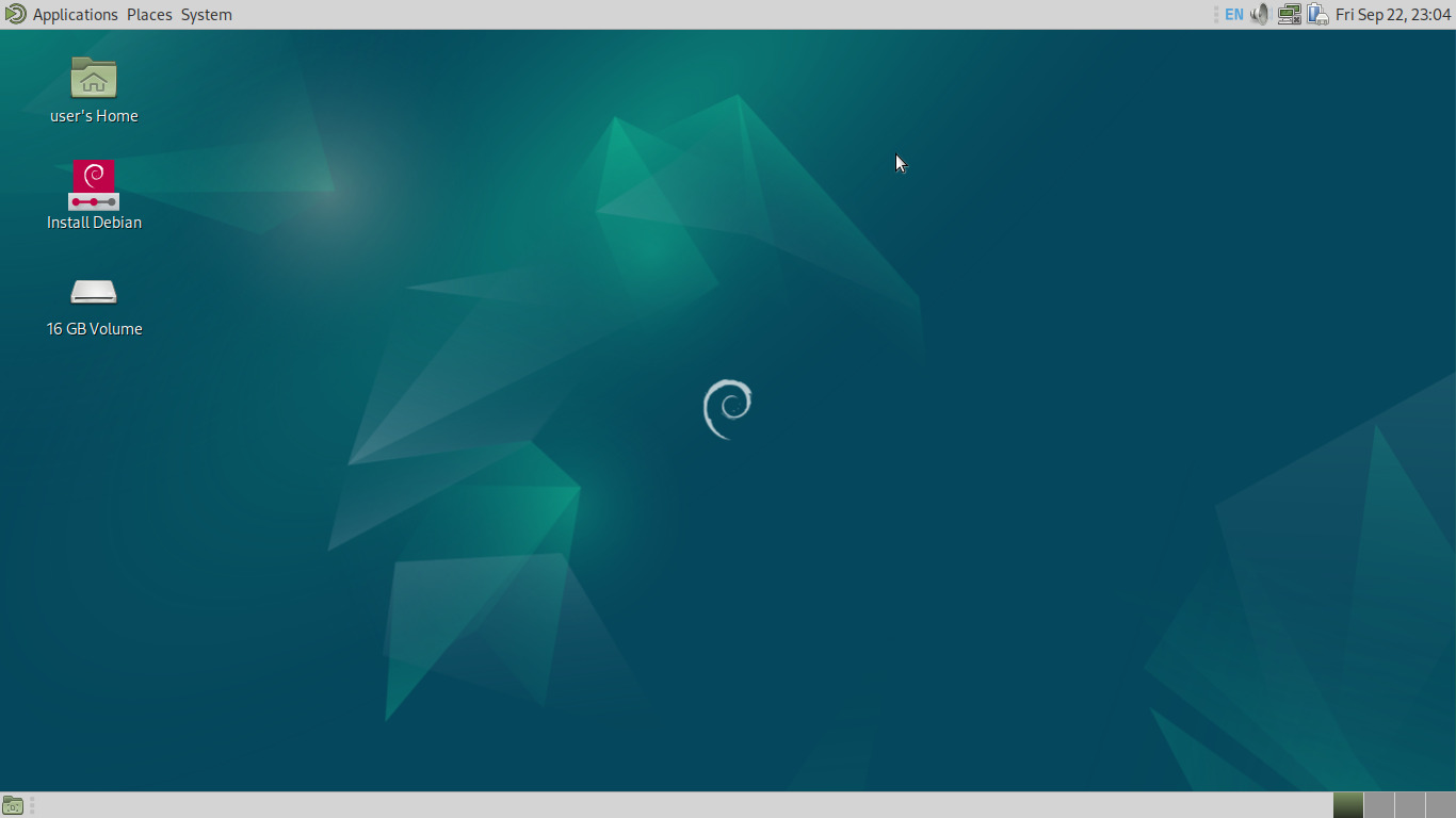
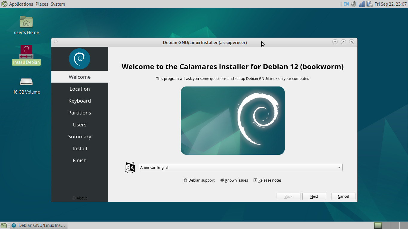
This is stock MATE, which, while a little excessive on the panels, ain't half bad by default. We're not going to muck about too much in the live environment though, so double click that juicy Install Debian icon:
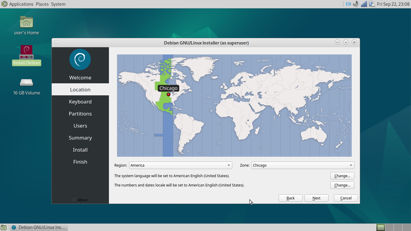
Next, we'll select some arbitrary location that reflects our time zone:
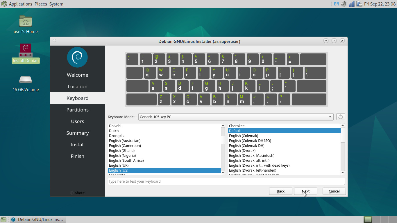
A default keyboard layout:
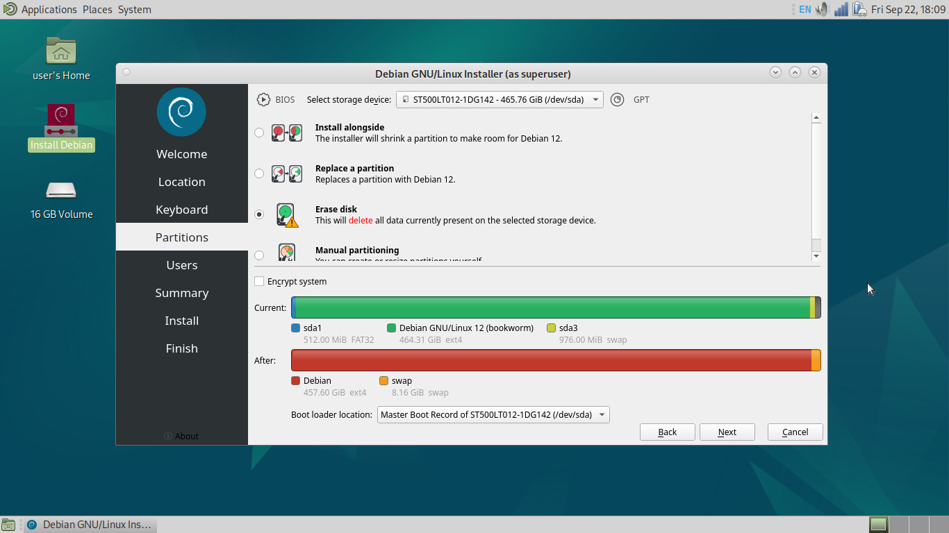
A partition set-up, which is much friendlier than what's in Debian's default installer:
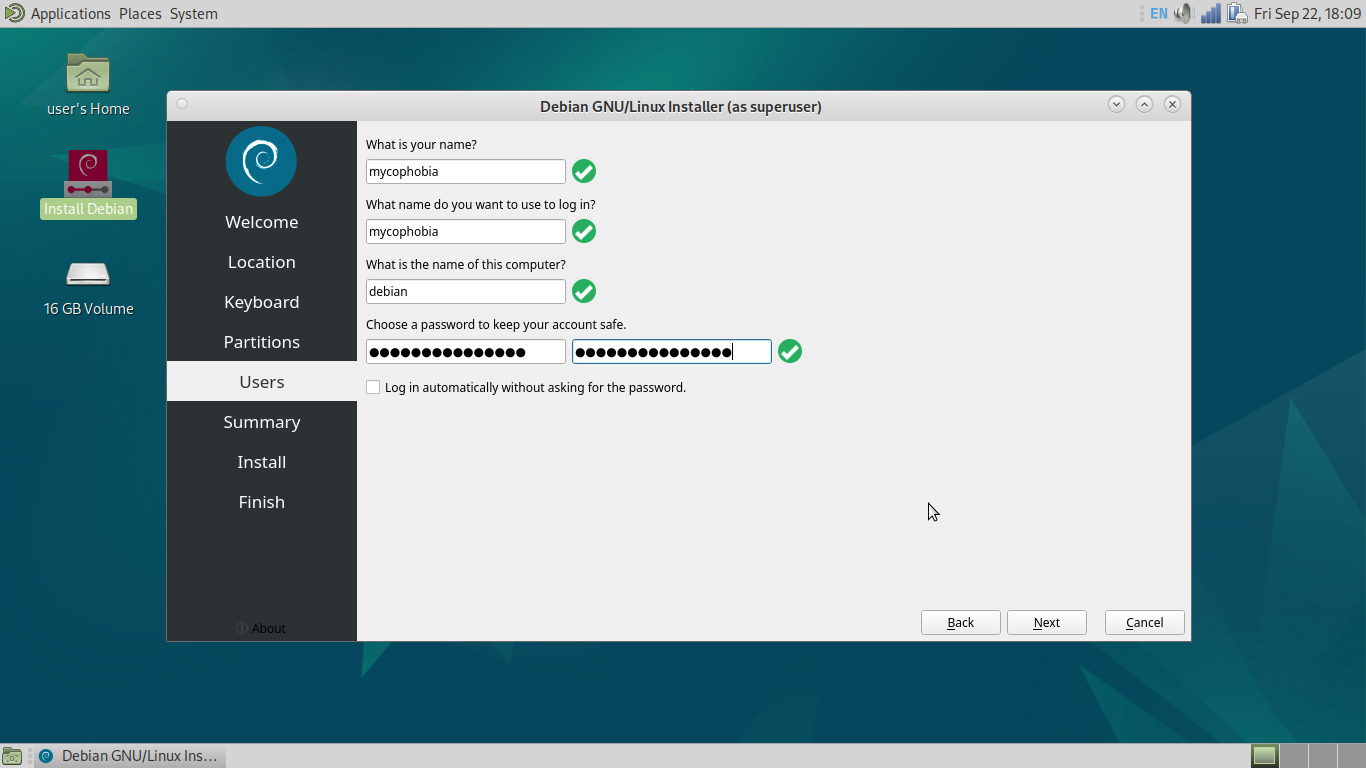
We set up our primary user, which, unlike Debian's installer, assumes we want to do the sane thing by default and disable the root account while giving us sudo privileges:
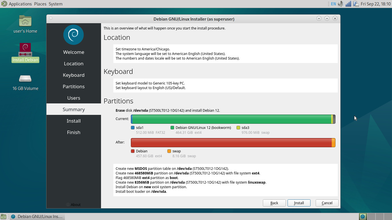
Locked and loaded, time to fire away:
Depending on the capabilities of your system and target media, this time estimate may or may not be unsettlingly wrong:
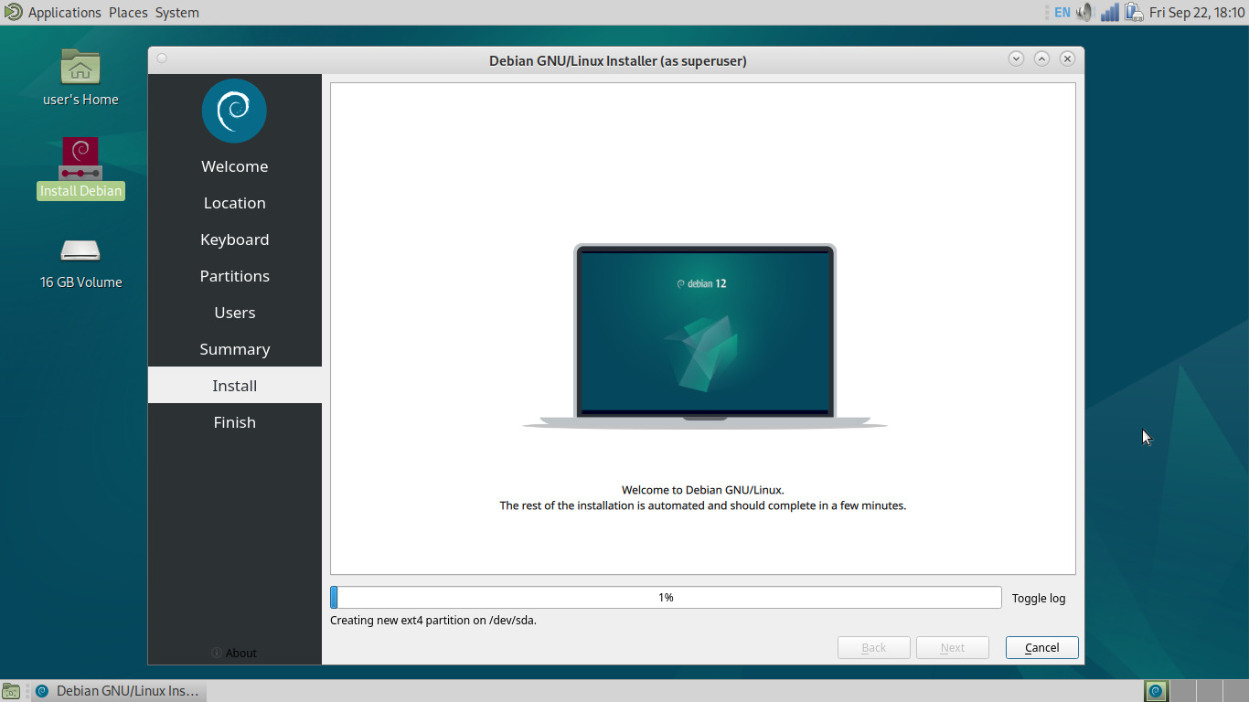
Using an old cheap garbage Dell something-or-other laptop with an aging HDD for the purpose of these screenshots, it took around 30-45 minutes, hanging at ~70% for a lot of that time. Give it a bit before deciding it's frozen for good. And with that, our shiny new operating system is installed:
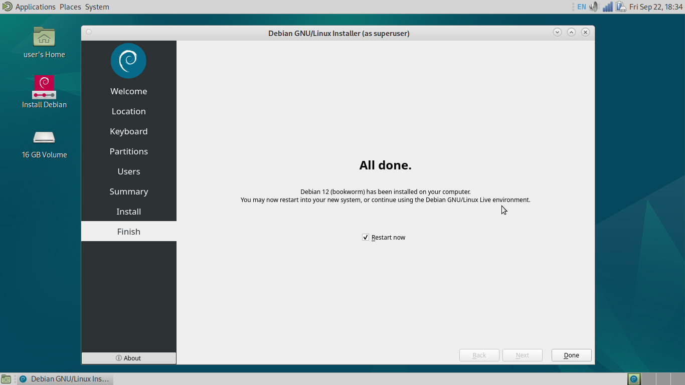
We reboot to no surprises:
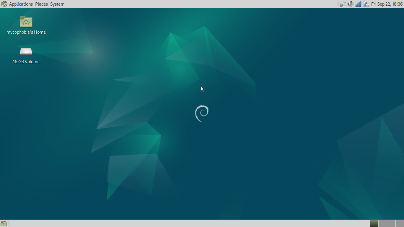
Stock MATE again. Now before we continue, I encourage you to go ahead and use the panel applet to connect to a wi-fi network if you need to do so, as we'll need internet access for the following steps.
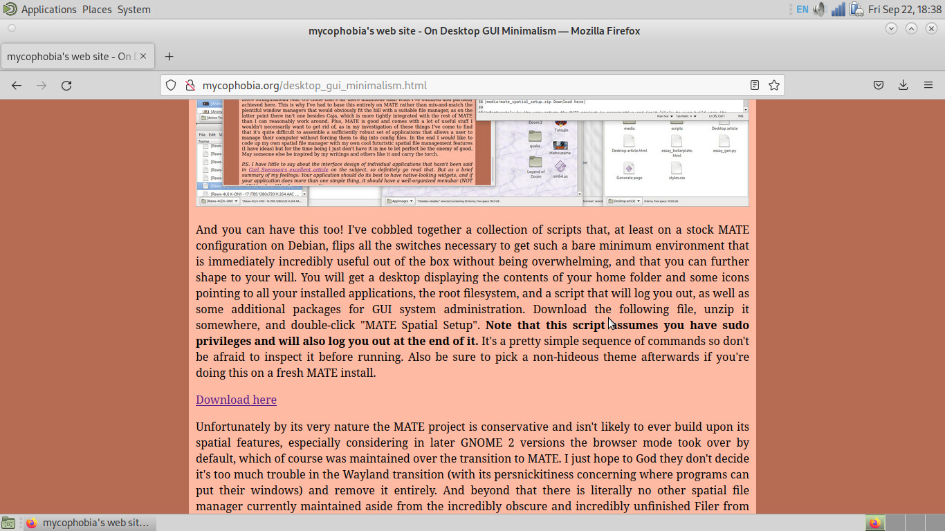
We head up to the default Applications menu, navigate to the default Internet submenu, and select the default Firefox and head to this very website to grab the MATE Spatial Setup scripts:
We extract them to the desktop:
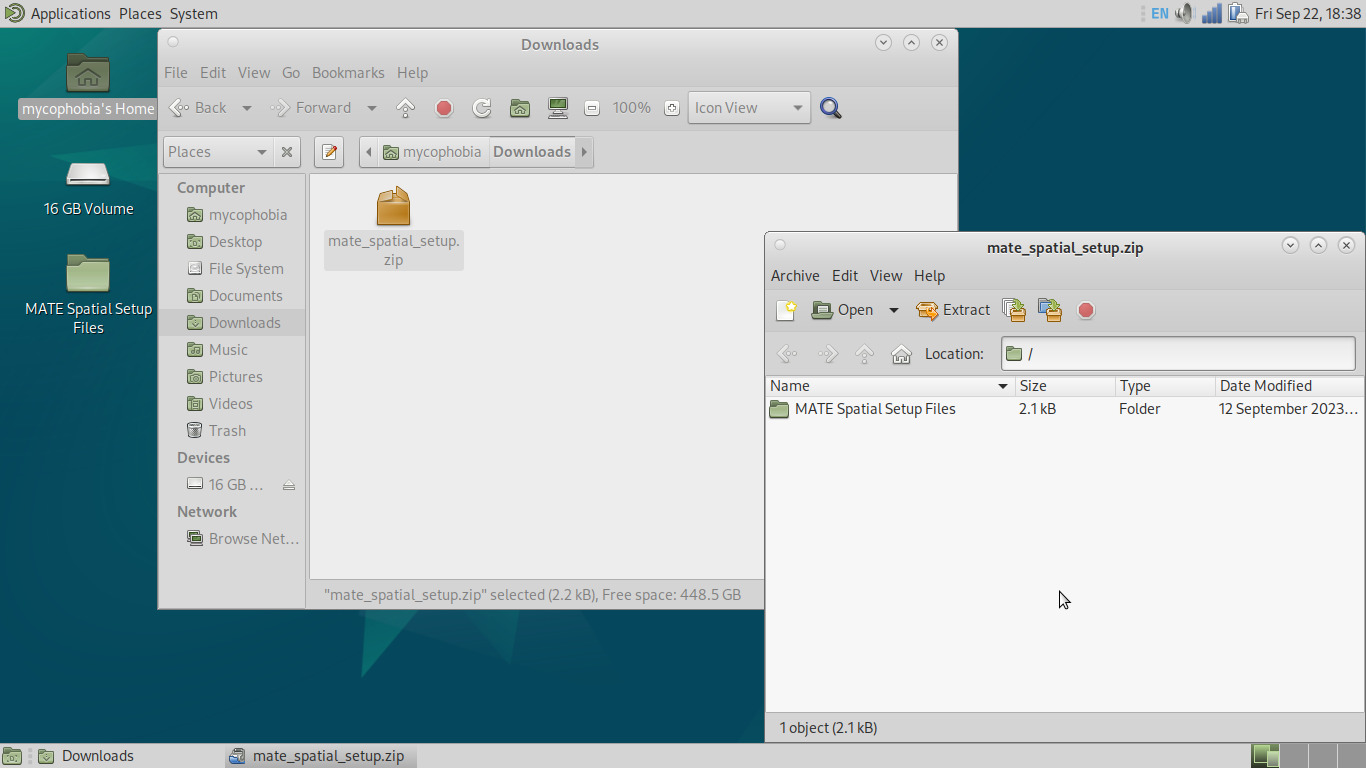
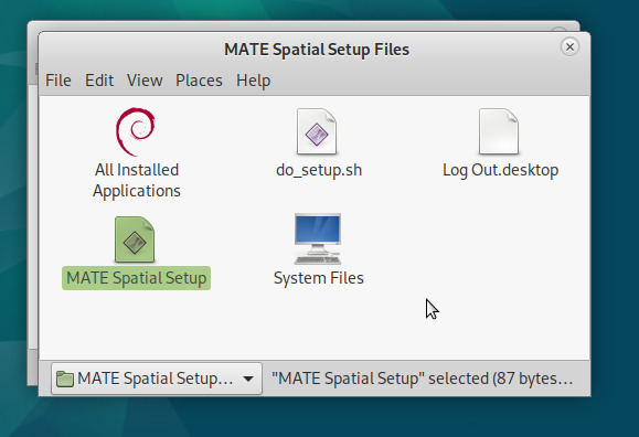
And we run MATE Spatial Setup. We definitely do not accidentally run the wrong script, resulting in a partial update and screwing up the following screenshots in a confusing manner, no sir:
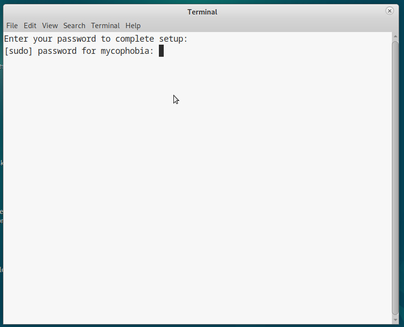
We're prompted for our password:
And then it runs a bunch of stuff. I encourage you to check over these before running as it's good practice to do so, particularly that "do_setup.sh", as that's the one doing the heavy lifting:
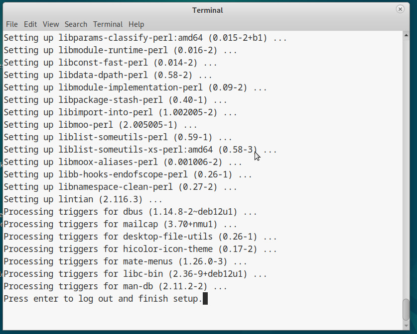
We obey the mighty prompt and log back in to see this:
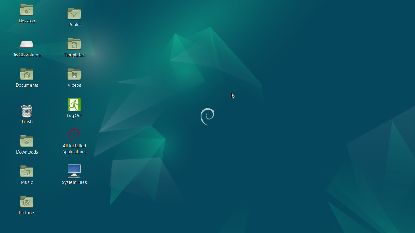
Our panels have disappeared, our desktop appears to reflect our home folder, and we get some icons pointing to some stuff. System Files pulls up the root filesystem, Log Out launches the log out dialog, after which we can shut down from the login manager if we want, but what we're concerned with here is the All Installed Applications folder:
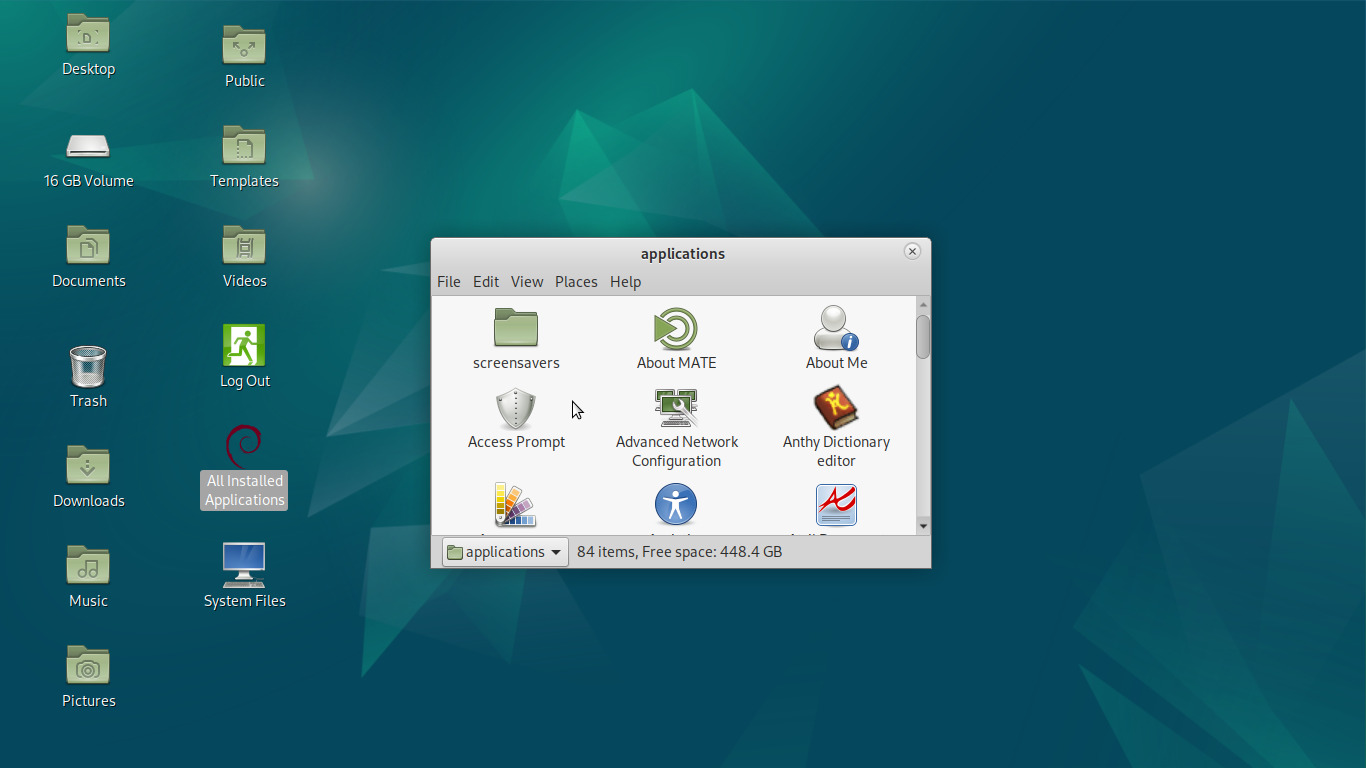
Most graphical applications are well-behaved enough that you'll find a nice launcher complete with icon in this folder. First thing's first, let's get rid of these horrid-looking window decorations in favor of something a bit classier. Find the Control Center:
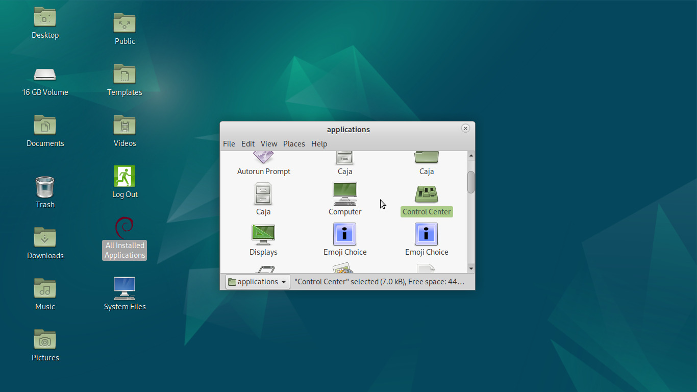
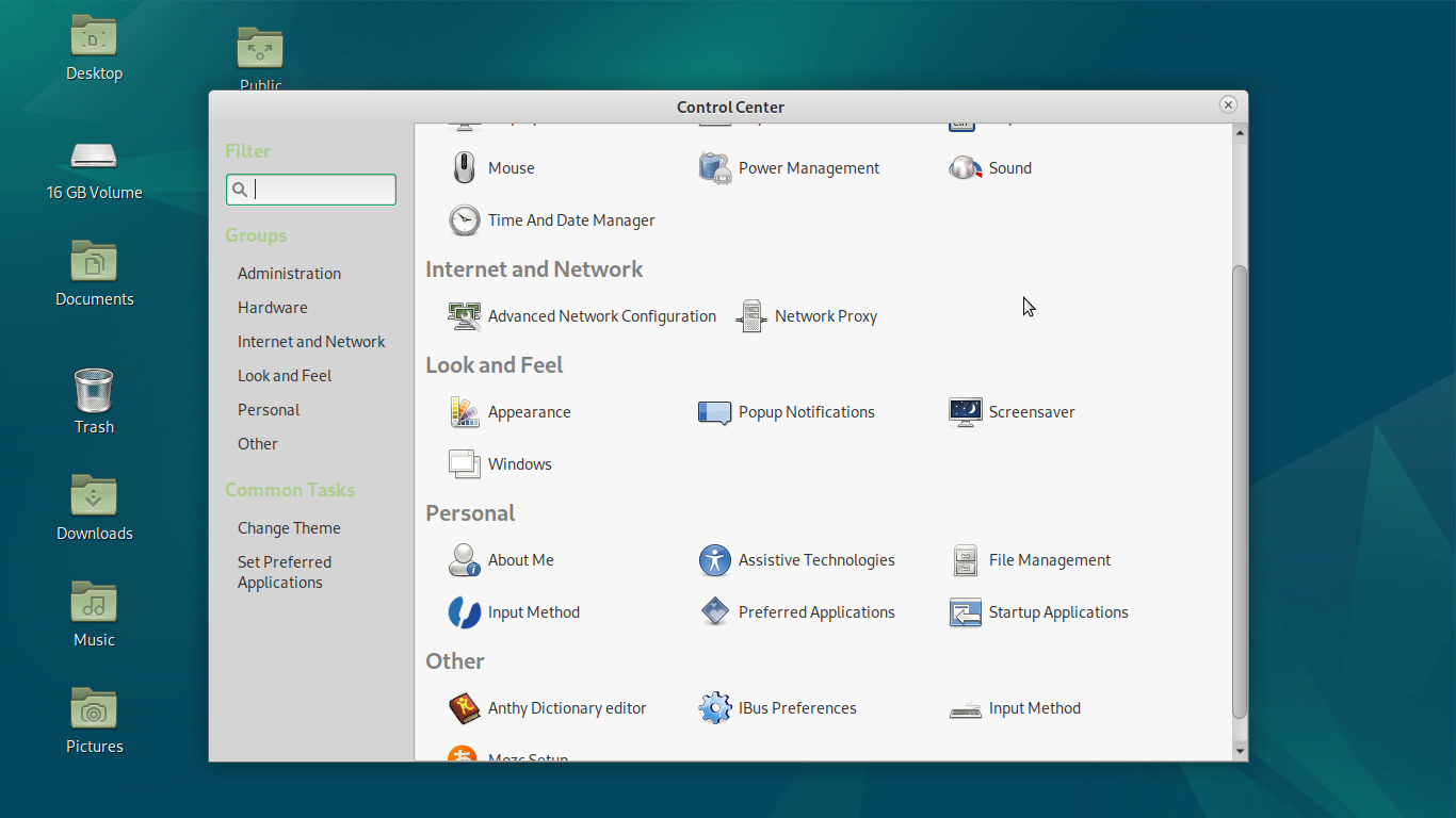
Then open it and click on Appearance (under the Look and Feel heading):
And let's go with the classic TraditionalOK:
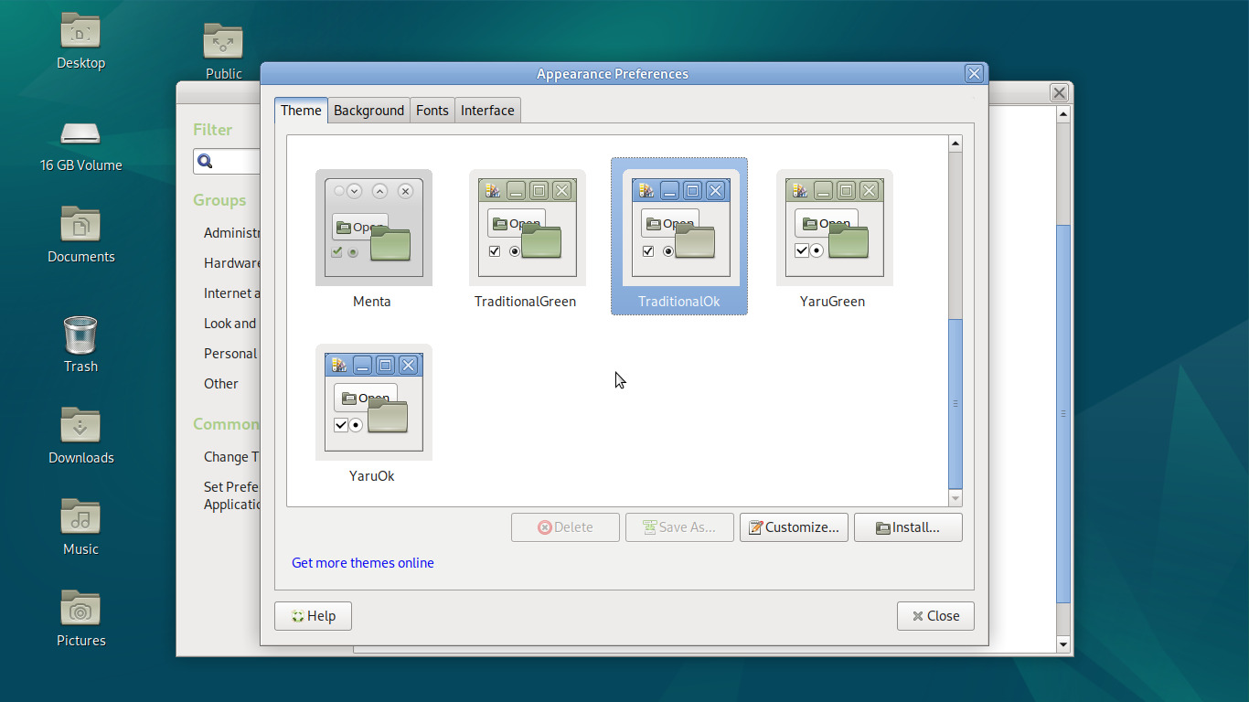
Ahh. Much better. Now what about this Applications folder? Can't we get a menu instead? In the name of one of our stated principles of Consistency, we will use the folder itself to achieve just that. Let's select View>List:
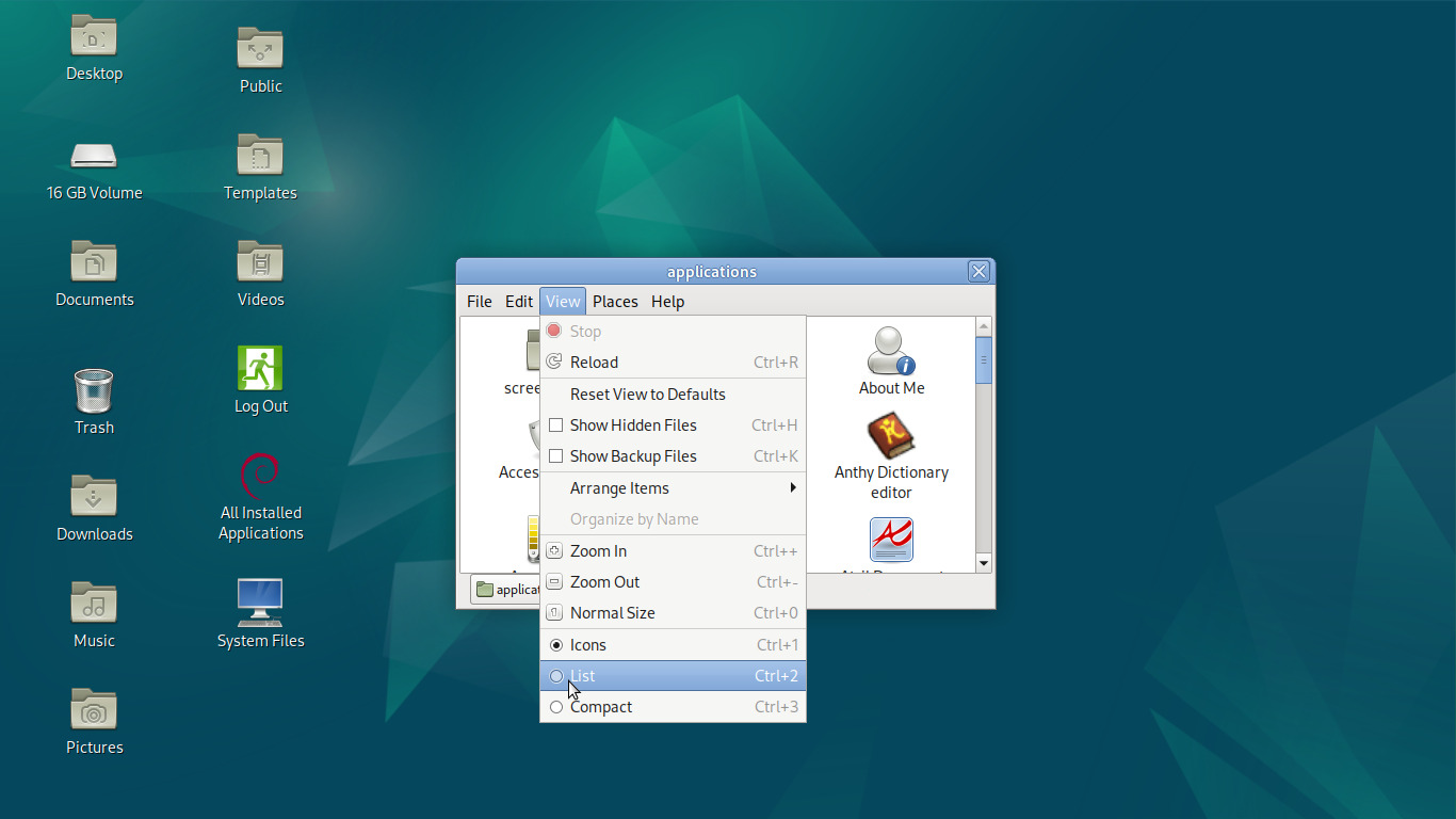
And we're looking a little more menu-like already:
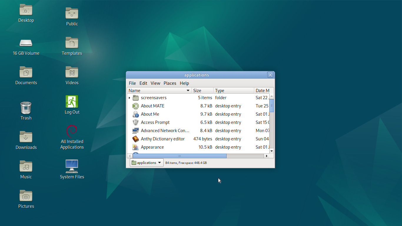
But we can do better; there's no need to see sizes and modified dates and such. Since this folder is effectively a launcher, all we're concerned about is what app it is. Let's go back to View and select Visible Columns...:
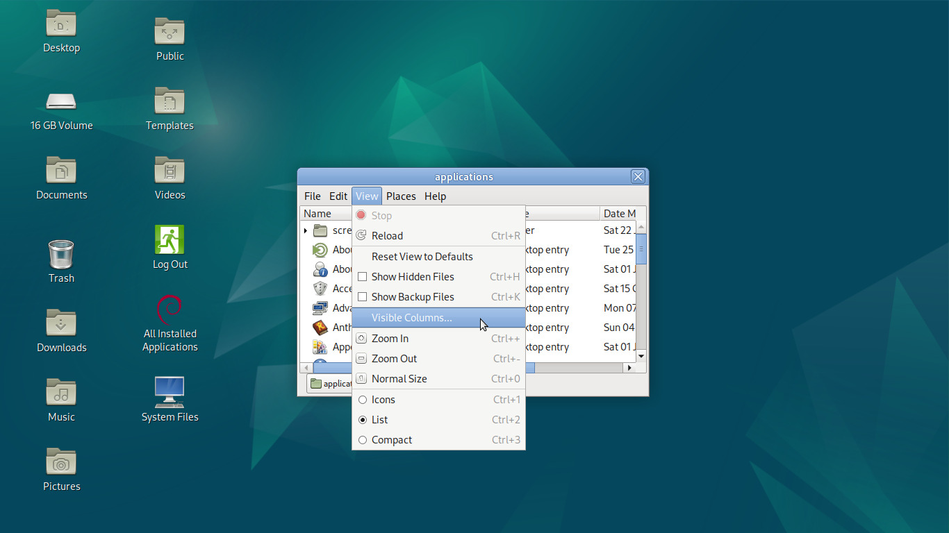
Deselect everything but Name in the following dialog:
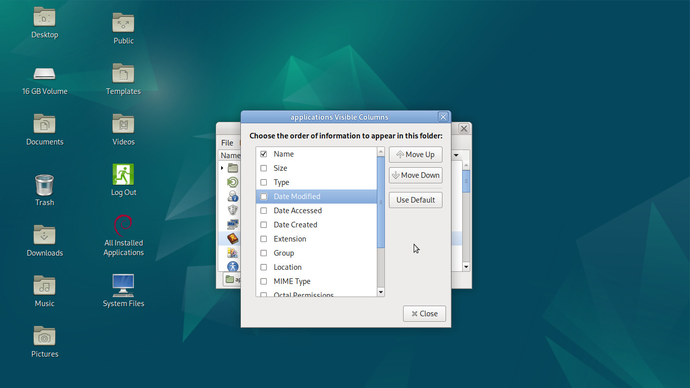
And for good measure, let's size and shape the window to be more menu-like and stick it in a corner:
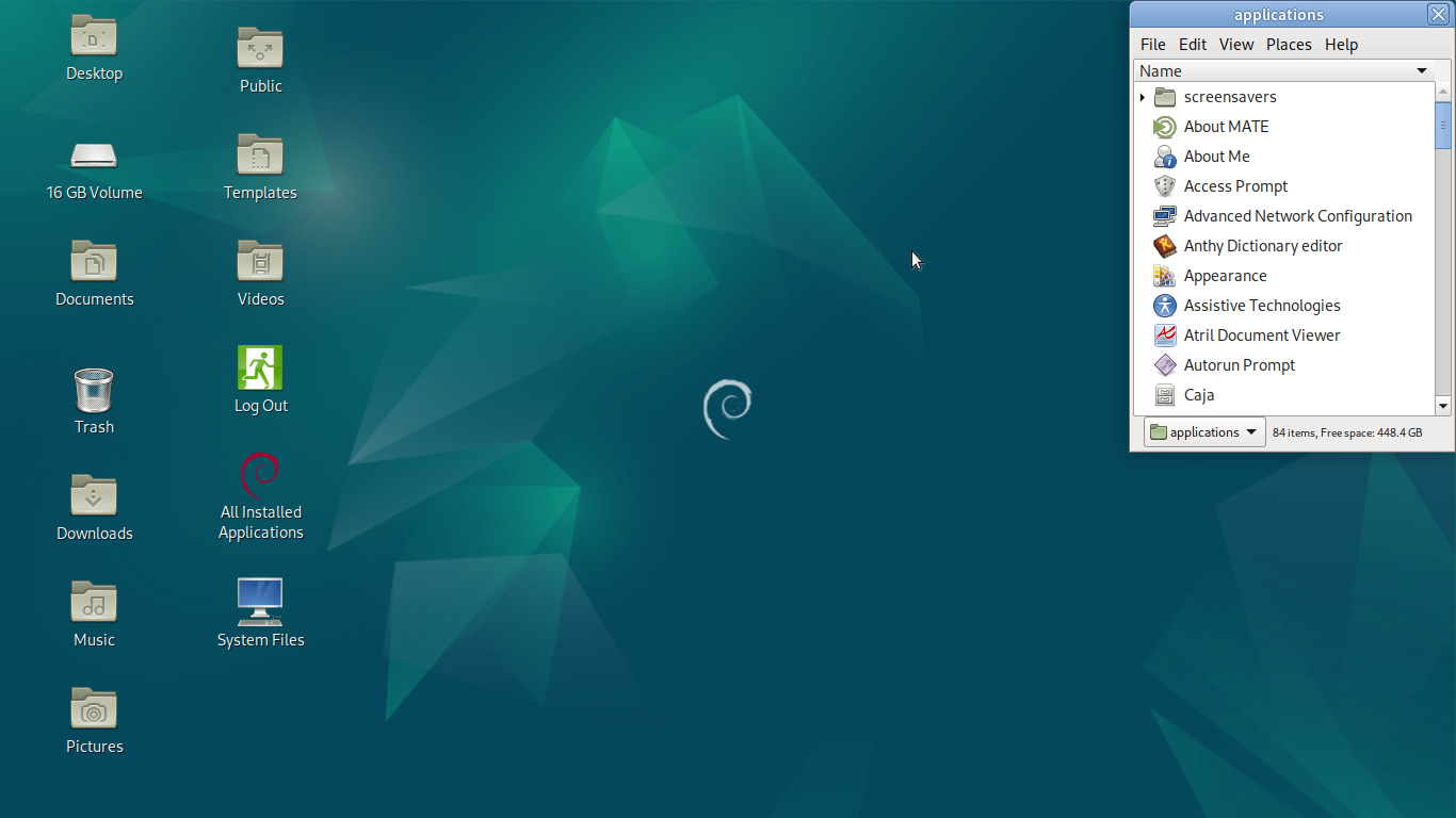
Very nice! And to see to it that it doesn't get in the way, we can double-click the title bar to shade it:
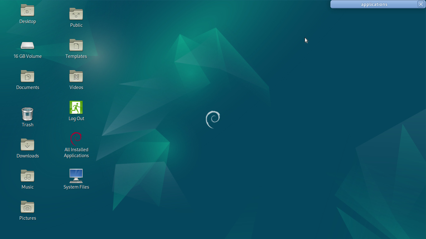
And we can even make sure it's always accessible, no matter what:
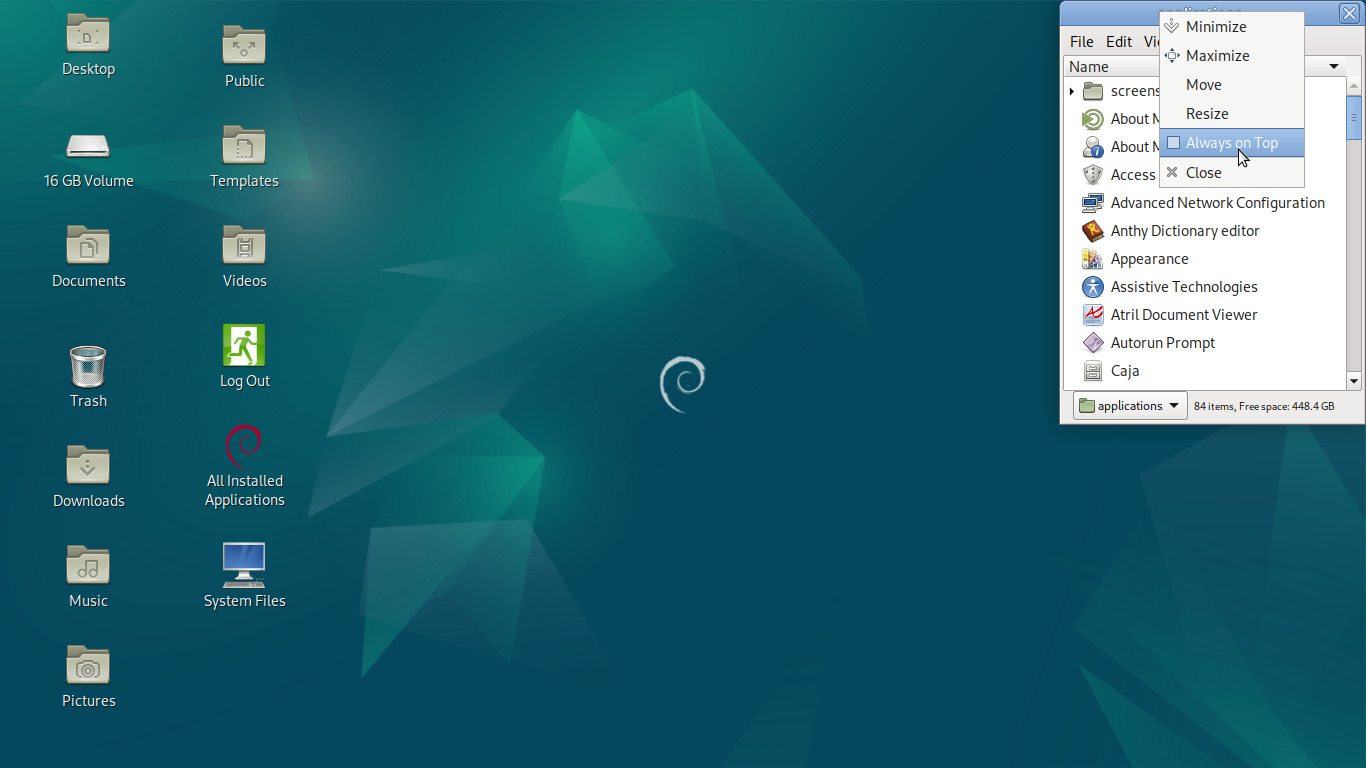
Why do this? Why not just use the dang panel menu? Utilizing the file manager in this way exhibits consistency, as this isn't an Applications menu, it's just a folder, and that means we can do this (or any number of other things) with any folder we like; they all have the same capabilities. And given that we are using a truly spatial file manager, every aspect of what we've done so far is retained should we close the folder and re-open it. It will open in the exact same position with the exact same size and shape and in the exact same view state, down to the scroll position and visible columns. The folder isn't just a viewport to some stuff on disk, it has a specific function that we've set up. It doesn't merely display the contents of /usr/share/applications, it is our Applications folder with an identity and function unique to it.
Let's keep going. We don't necessarily want to scroll through a menu of every installed application to get to the thing we want, what about a nice subset of those in a smaller menu? Let's create a new folder on our desktop just for that:
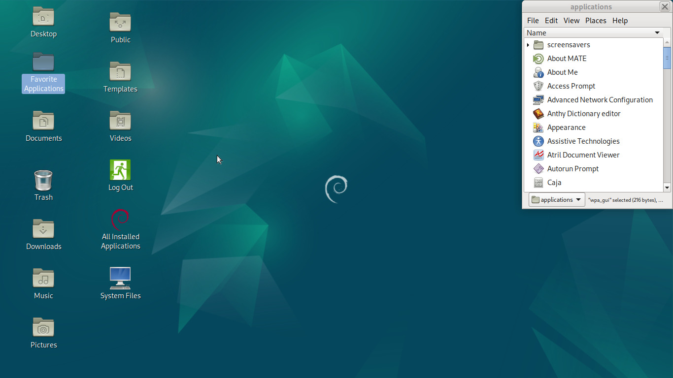
The GUI-centric way of working we're trying to foster here means that we shouldn't shy away from using mixed-case, spaces, and symbols in file names. We should make them distinct and easy to read. So let's open our new folder and copy over the launchers we want from our Applications folder. However, because MATE is a Linux project and that means it inexorably does some things weirdly, we can't just drag and drop from a write-protected folder like Applications and expect it to copy instead of move like one would expect, no, it has to loudly fail to move it instead and maybe you'll get a copy of the file on the other end. Let's avoid that and hold Alt while dragging our icons, thus on drop popping up this little menu:
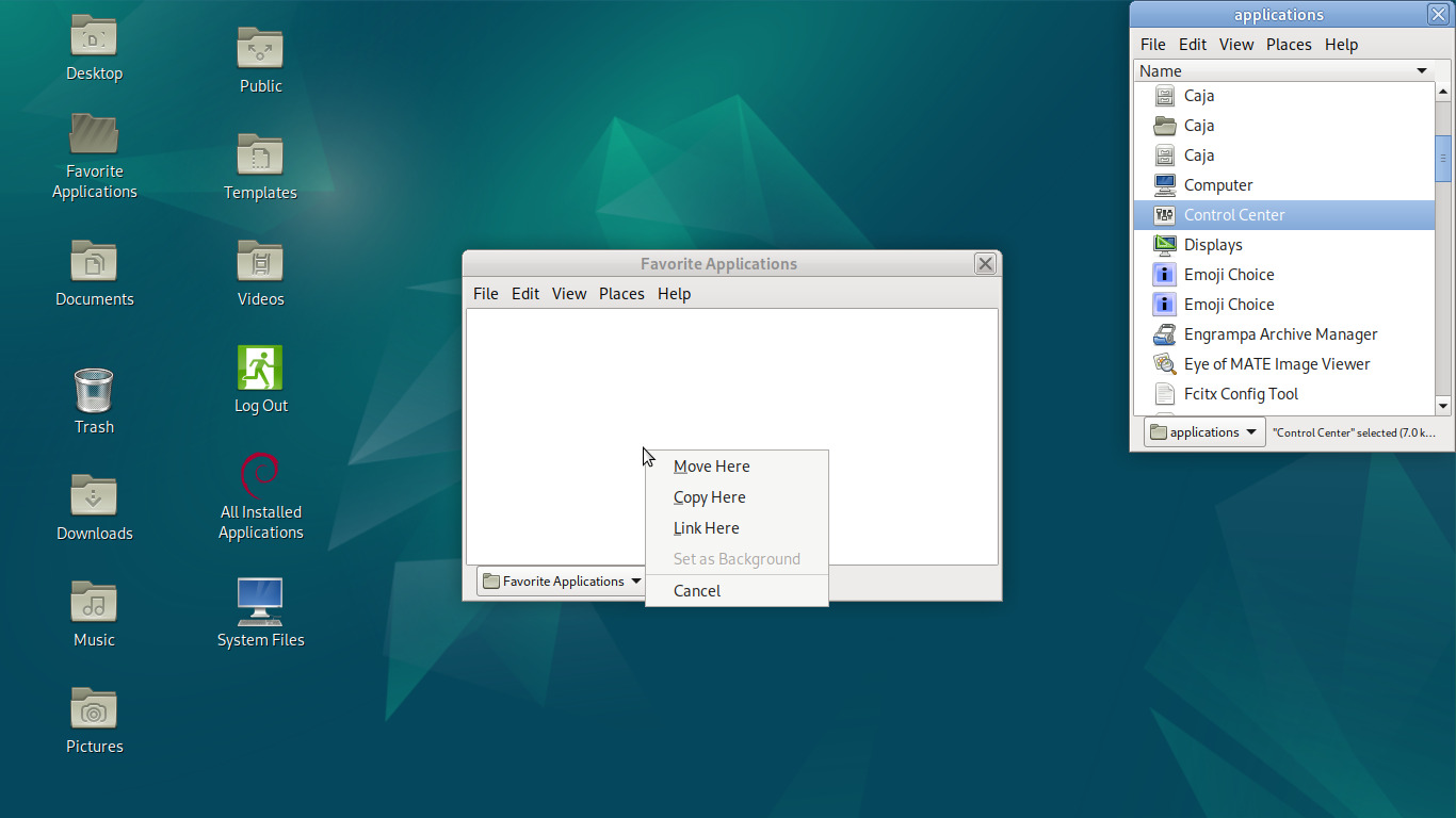
We'll select Copy Here, and it will dutifully copy the file without fanfare:
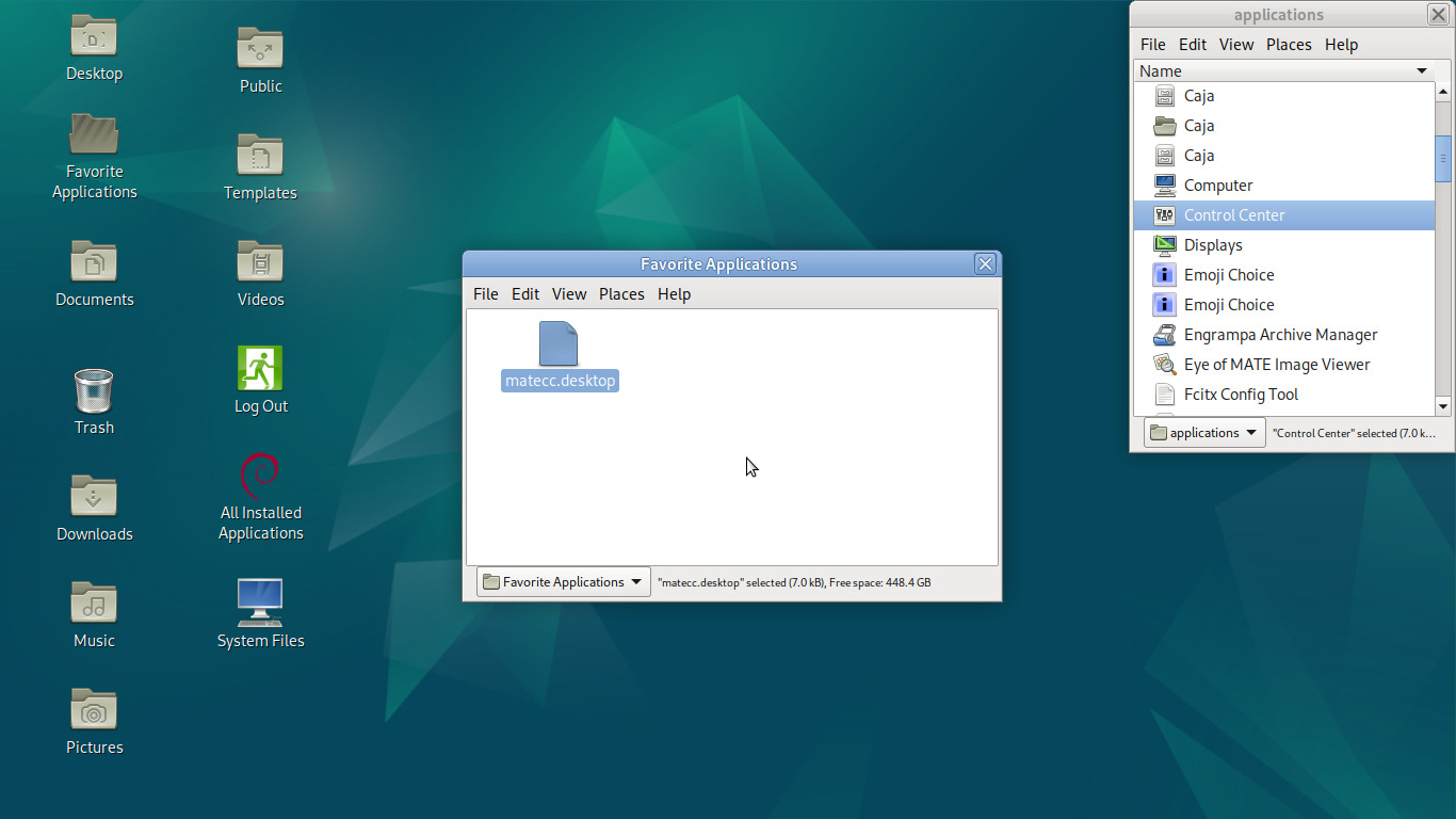
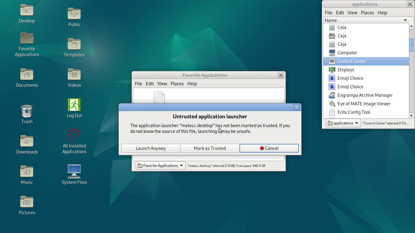
If the file manager doesn't recognize a .desktop file, it won't make it look like a normal launcher icon. This is a feature, as .desktop files can be disguised to look like other kinds of file. Here we just need to double-click and set it to trusted, and sometimes you'll have to hit F5 to refresh the folder and make it visually take effect:
And there we go, a functional launcher in our new folder:
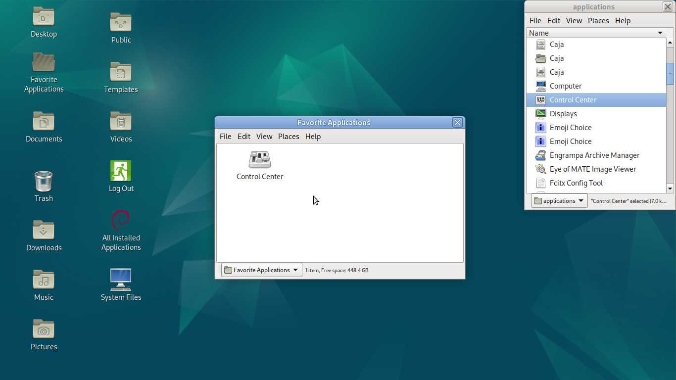
We repeat the process of Alt-drag>Copy>Mark as Trusted for every application we want easy access to:
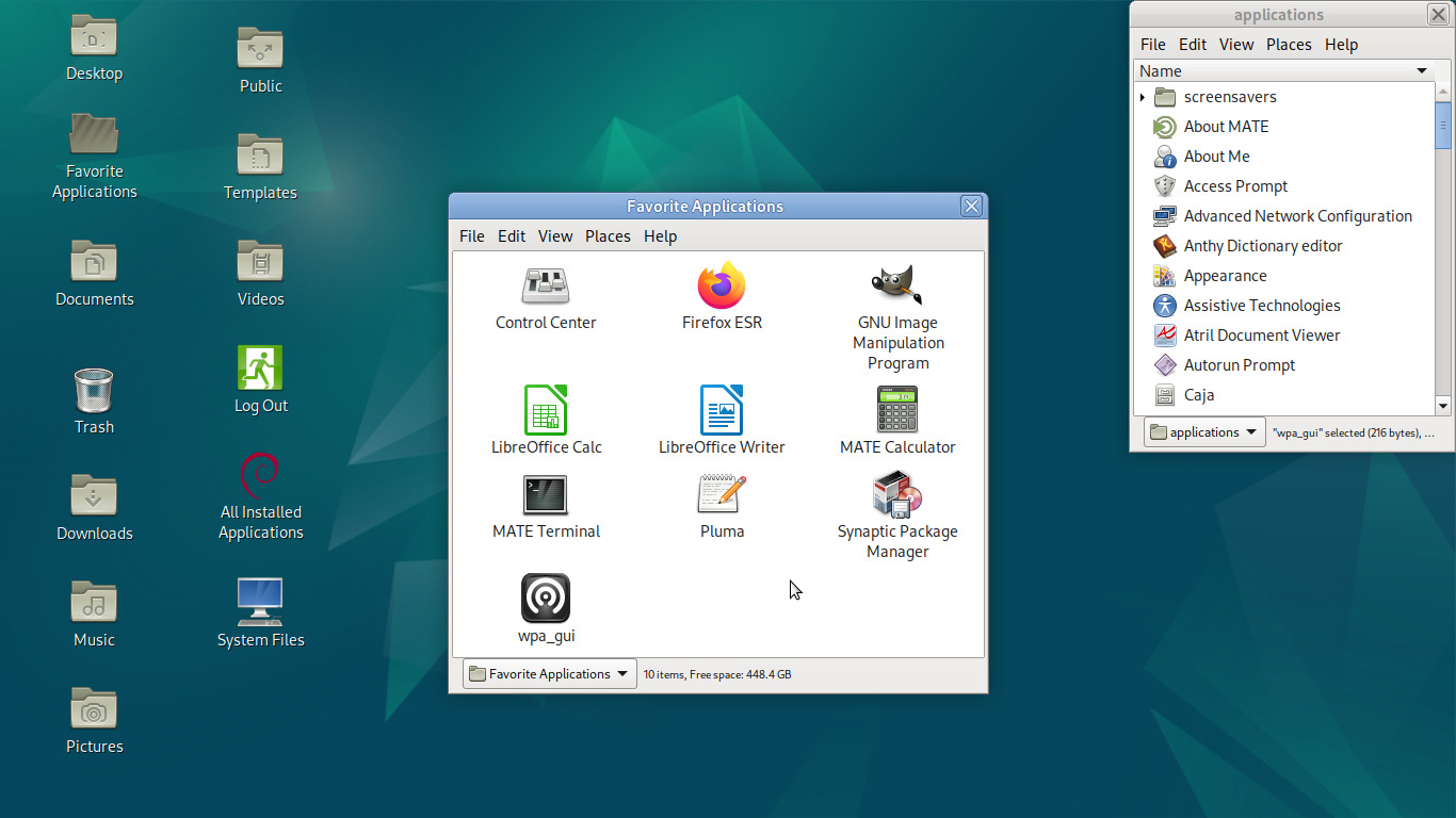
Alright, now let's repeat the process we did for the Applications folder and make it into a menu-like thing parked at a screen edge:
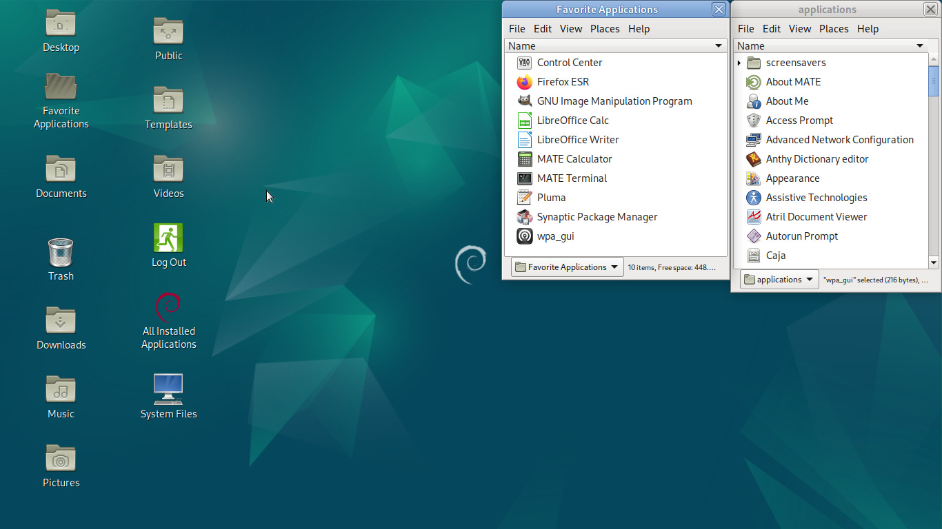
Maybe even zoom in to make them more easily visible (using View>Zoom In or holding Ctrl and moving the mouse wheel up):
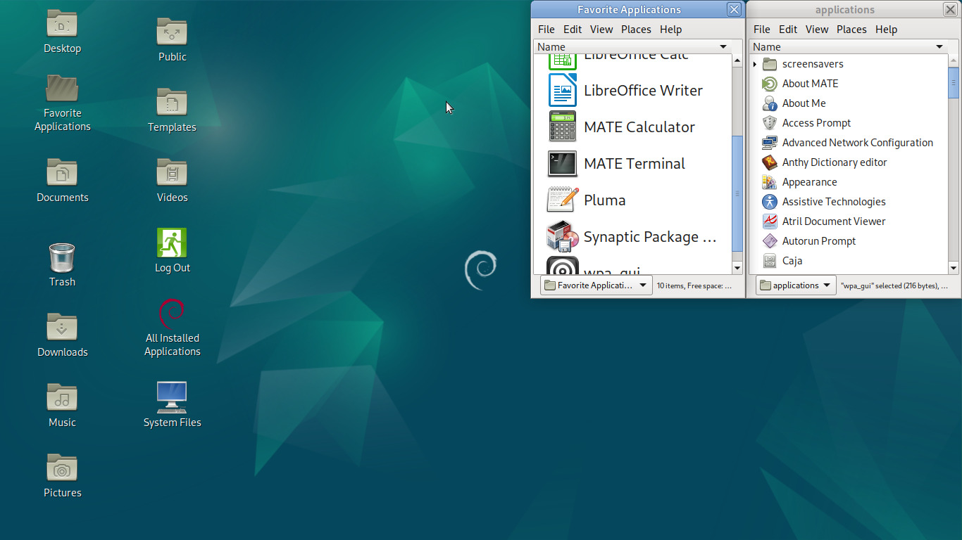
Not bad. But honestly for such a small amount of applications I'd rather have something a bit more personalized and not so automatically ordered. I want these apps to be where I want them to be, so we're going to turn this folder into a kind of mini-desktop. First switch back to the icons view and then select Arrange Items>Manually:
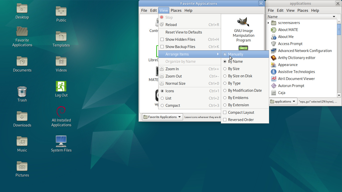
And then we'll zoom out one level to keep the window compact and arrange these icons in a way that makes sense to us:
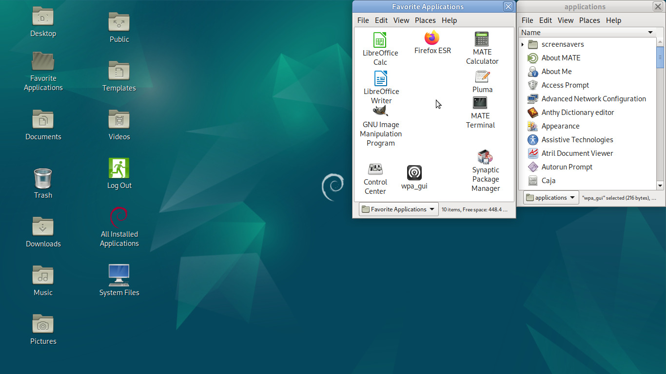
If we go to Edit>Backgrounds and Emblems, we can even apply a suitably cheesy default background image (though you can make it whatever image you want):
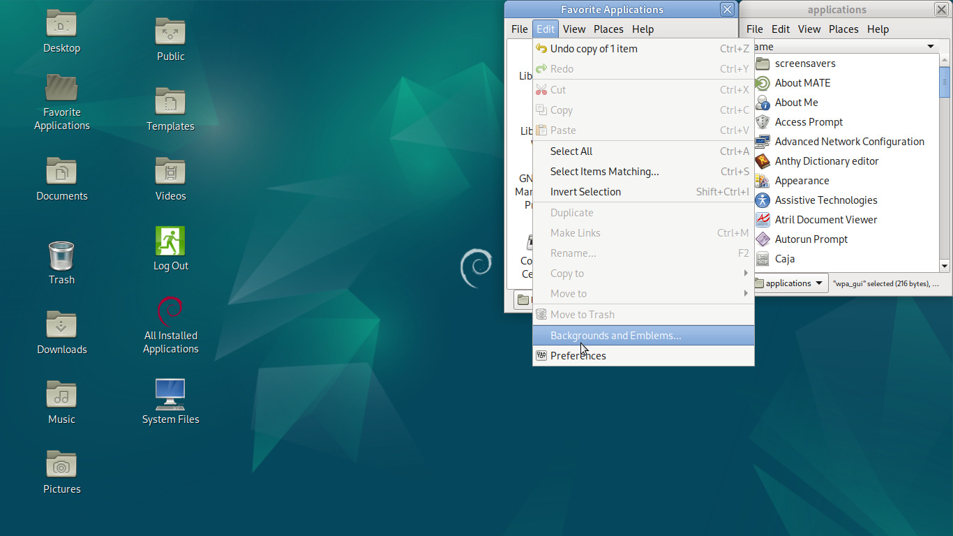
Ta-Da!
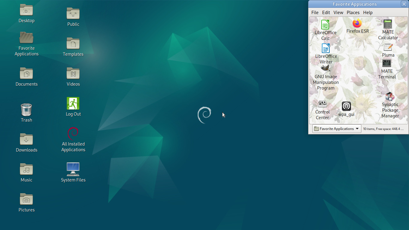
I hope the idea is a bit more clear now. This is not merely a list of files. This is a folder that we can manipulate like a physical object, distinguish it not only by its contents but how we've spatially arranged them in position and zoom level, and the folder itself is distinguished by its size, shape, position and grandmotherly wallpaper. All of this is retained across opens, closes, log-outs and reboots. We make a change to the folder, and it keeps them. We arrange our tools to our liking, they stay where they are, and our muscle memory develops to the point where we're opening Firefox and Gimp as if we were opening a box and pulling out the tool we need, in other words without conscious thought. What an utterly boring and wonderful concept.
Our desktop is the basis of all operation with our computer, so let's give it a little care:
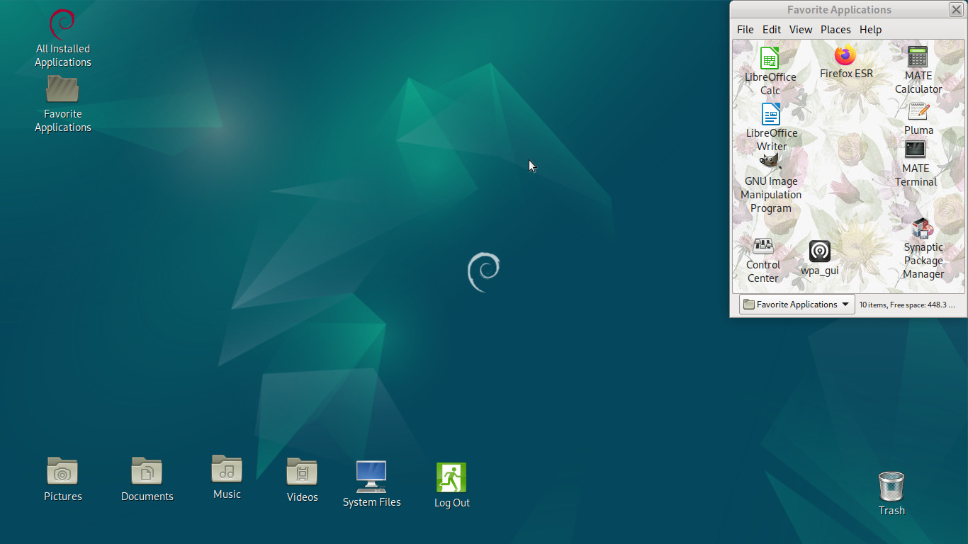
We've gotten rid of some folders we don't really need and arranged the remaining icons to something approaching logical. While we're at it, let's open most of our favorite applications at once for no particular reason:
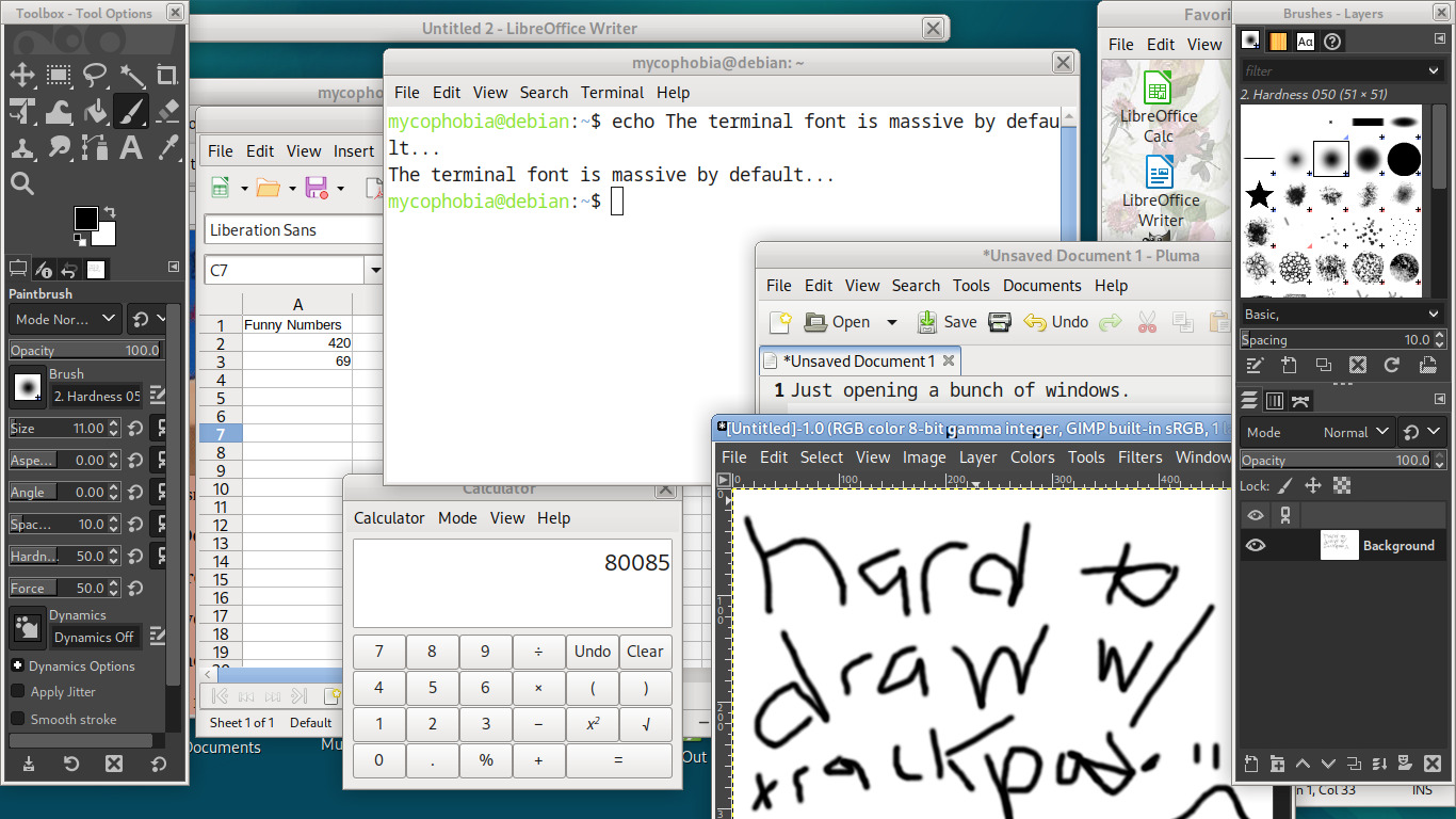
You can leave a remarkable amount of things visible at once, even on this tiny ~720p screen. And for the rest you can windowshade them when not in use; you don't have to alt+tab or scrub a dock or taskbar or menu to bring them back, either. They're right where you left them. Let's click the barely visible area of the Firefox window to bring it to the front, and shade some of these other things:
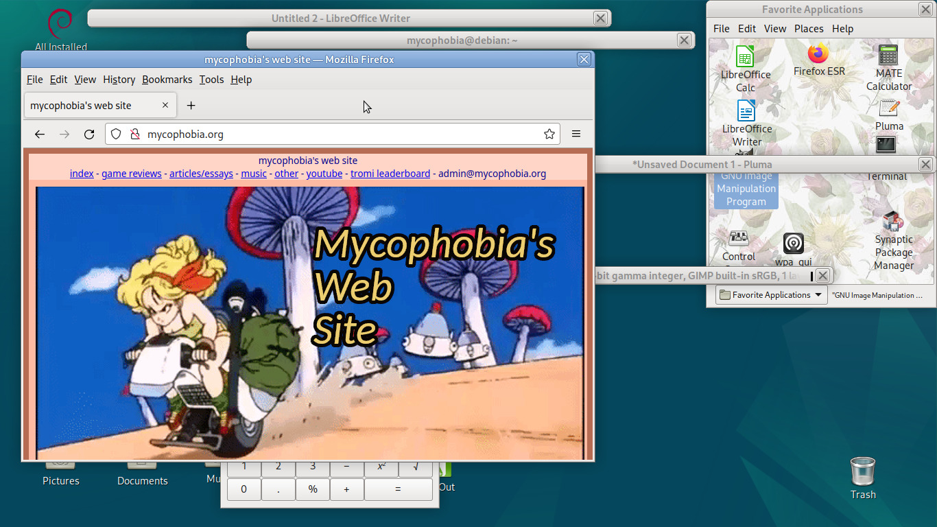
Hey, that's me! Wait, we just obscured the LibreOffice Calc window completely though. Should I shade the Firefox window, move the Calc window out of the way, unshade both, and then move the Calc window back where it was? Well that's certainly valid, but Marco (nee Metacity) has a neat feature:
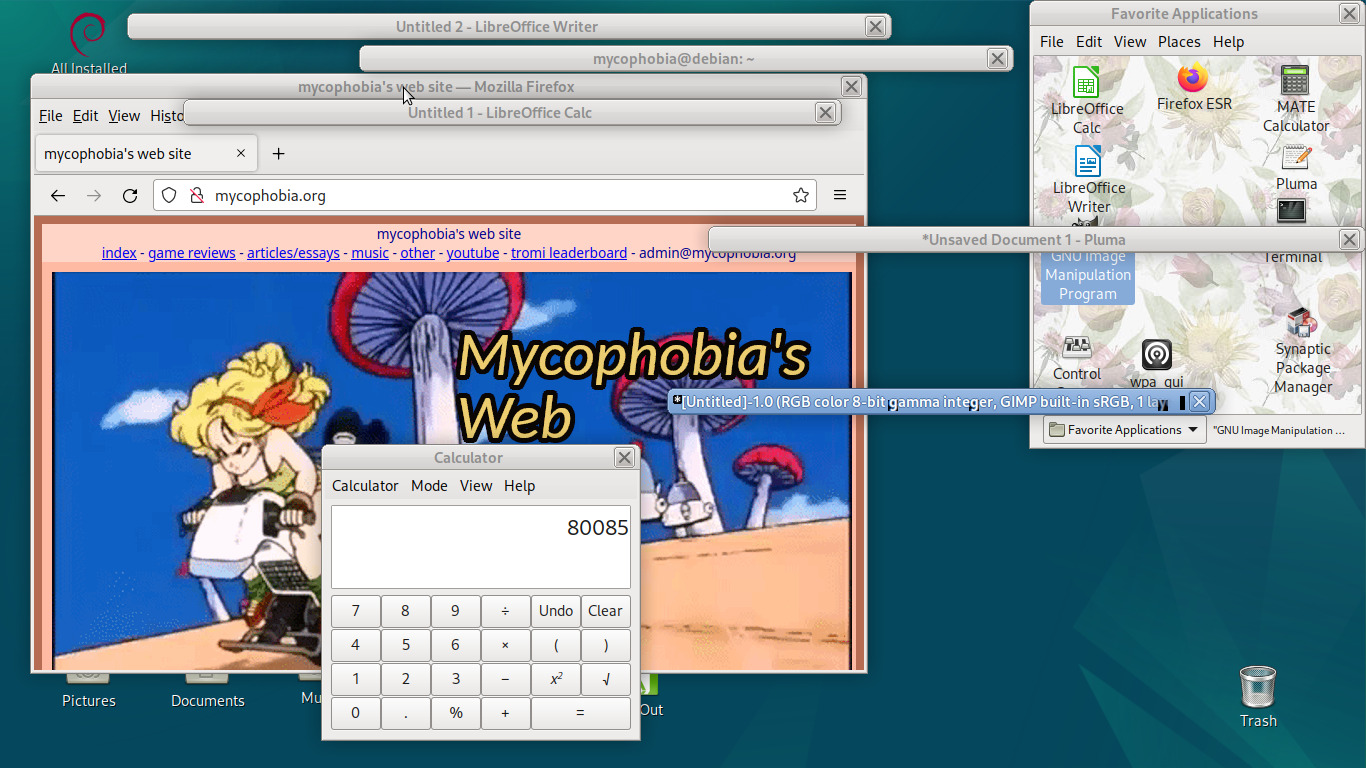
Just middle-click the titlebar to lower the window to the bottom of the stack! With what little this environment offers we have a veritable file and window management swiss army knife, full of possibilities, and all of it is up to you. Supporting it is a thoroughly-tested and secure base that doesn't change without your say-so, connected up to a vast repository of additional, equally well-tested software. And none of it is even particularly resource-heavy, as with the OS and environment running with all of these applications open we're using a mere 1.9 GB of RAM:
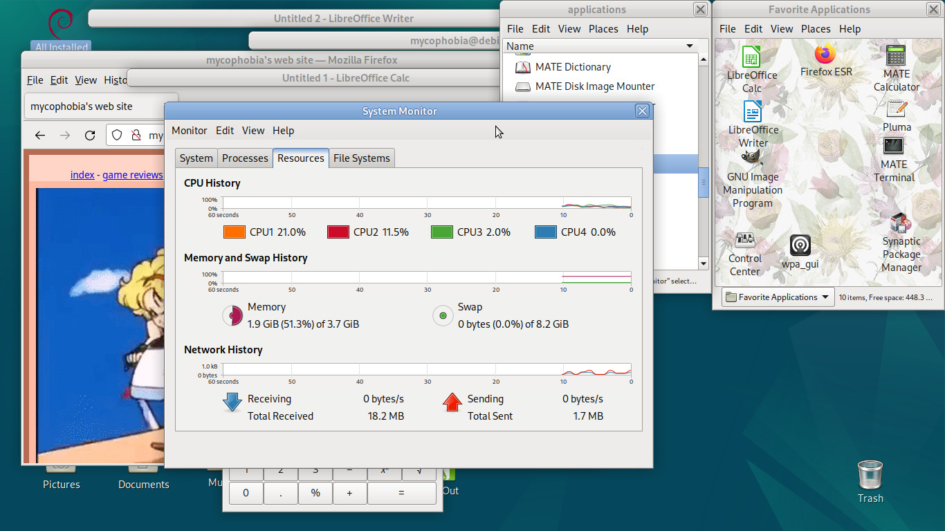
Well these days that warrants a "mere" I reckon. And this is just the tip of the iceberg; as I've said, the environment is completely malleable and can be modified in many different ways to suit your needs. You can create your own custom launchers with shell commands and have them open up in a terminal when activated; in this way, for example, I made a launcher icon that I can drag and drop YouTube URLs to, as in straight from the Firefox address bar to the icon itself, so that yt-dlp downloads the video to my desktop in the highest available quality without exceeding 1080p. Things like this allow me to take common terminal tasks and make them into objects. Here's a gratuitous screenshot in an already egregiously screenshot-heavy essay of the desktop computer I'm writing this on right now:
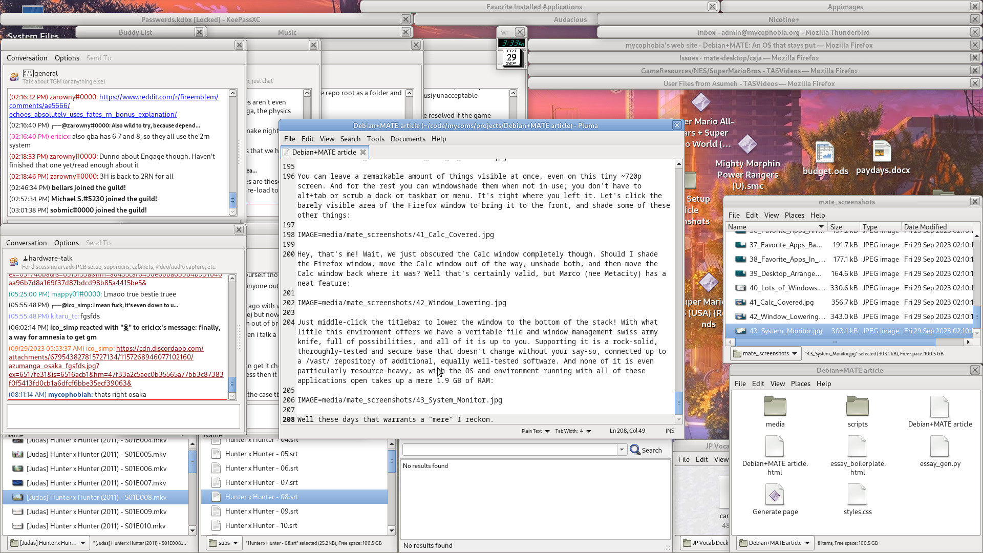
A lot of open windows, sure, but I arranged every one of them, so I know what's where, and how to get to it quickly. For stuff I don't leave open all the time I have two folders windowshaded at the very top in that kind of "secondary desktop" arrangement for easy access to anything, including the aforementioned YouTube downloader. Many unorganized icons sit on my desktop arranged around my usual windows so that I can always get to them, usually requiring shading just one, occasionally two, windows. They'll sit there until I decide I'm done with them for now and I can file them away into some folder. If I want to take a break from writing or learning Japanese and for some reason I want to struggle with Super Mario 64 DS's infuriating digital controls for a little while, I just double-click the icon that I know is sitting barely obscured by that mate_screenshots folder because that's where I left it. I don't even have to think about the name of the file, what it starts with, or even what the icon looks like because it's right where it's always been since I downloaded it. The one impulse carries me through, just as one uses a doorknob to enter a room and flips the lightswitch directly afterward. A fellow at Hacker News saw the screenshot I posted in my previous article and claimed they wouldn't be able to get anything done with all that clutter. It looks chaotic, and well, it is, but it's my chaos. The idea here isn't to have an interface that makes sense to everyone and is usable by everyone at first glance, the idea is to give the user the power to set everything up in a way that makes intuitive sense to them. I have no difficulties navigating any of this, and if you were to set your own environment up with such care, then I assure you with it, you wouldn't either.
So a big thanks to Debian and the MATE team for providing the sanest computing experience I've yet to find. And with that, this is definitely the last time I'm going to write a 4,000+ word essay about all this crap. Guaranteed!